Tuesday, July 23, 2013

Returns to inequality in the NBA

Take a look over here if you want to get the background for this series, otherwise read on.

Sports + Numbers Prediction: "My guess is the NBA will have the biggest returns to inequality as a proxy for teams having stars. With those stars they are not able to afford middling salaries for role players and drop quickly down to minimum salary or exception-level players."

The data

To see the impact of inequality we will look at each team’s Gini coefficient against their winning percentage, controlling for team spending. The resulting equation gives us an r-squared value of 0.32 with both terms being significant (P-values of 0.000008 for spending and 0.00004 for Gini coefficient).
Payroll and Winning %

For every million dollars in team spending the expected increase in winning percentage is 0.005. For a team that spends $20 million more than a comparable team – all else equal – we would expect them to win an additional eight games.

Gini and Winning %

On inequality the coefficient is 0.67. In theory this would tell us that a team with a single superstar making all of the money (stay with me, I understand this is not possible under the NBA CBA) would have 55 more wins than a team with all players making exactly the same salary. In practice we have variation within a much smaller band ranging from 0.09 to 0.56 (see table below for details) so the projected difference if those two teams had the same salary would be 25 games. 

Gini and Payroll, color coded by winning percentage

Wednesday, July 17, 2013

Returns to Inequality: Introduction and predictions


As a follow up to my data dump post on league-level and individual player inequality in sports, I want to go a level deeper in each league and see where inequality makes a difference on the field (or court, or ice). This series of posts will look at each league and run a simple regression of winning percentage against overall payroll and team Gini coefficient.

I expect there will be relatively low correlation between spending and winning in the harder-capped leagues (NHL and NFL) while the NBA and MLB should show some.

The real interesting point will be whether prominent current teams that are more unequal (stars and minimum-salary guys: the Miami Heat or New England Patriots) are successful as a rule or as an exception.

A few predictions before I get started:

NBA – My guess is the NBA will have the biggest returns to inequality as a proxy for teams having stars. With those stars they are not able to afford middling salaries for role players and drop quickly down to minimum salary or exception-level players.

NFL – I would think the returns to inequality are high here, but not exactly as a proxy for having stars. The NFL’s cap structure essentially forces teams to play rookies and younger, pre-contract extension, players heavily and supplement them with selected veterans. The catch is that nearly all teams have a big young player population so the difference between one that works out and one that doesn’t might not be visible in the salary distribution.

MLB – This is anyone’s guess. The returns to inequality – after controlling for the wide distribution in overall team salary – might be strong or they might not. I don’t have a good feel for it so this will be more of a fact finding mission.

NHL – I am guessing that returns to inequality are strong here too, with relatively high leverage of the individual players resembling the NBA more than the NFL or MLB.

Tuesday, July 9, 2013

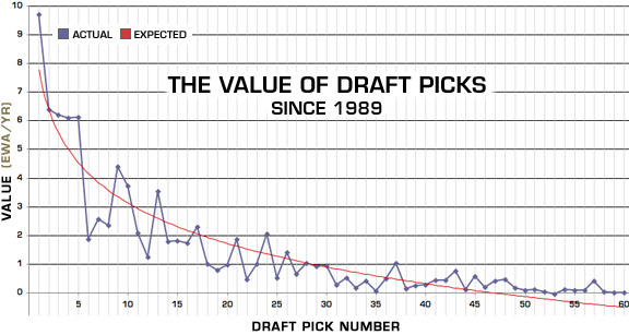
NBA draft picks as assets – the triumph of hope over experience?


Zach Lowe had an article up today on Grantland about the current view around the NBA that draft picks are extremely valuable assets for teams to stockpile and use in future trades. He explains:
The word "asset" has never had more currency in the NBA. Draft picks, even in the 20s, are "assets" teams can use to acquire cheap talent, or to grease the wheels in potential mega-trades for star players. The Celtics view the three unprotected picks they nabbed from the spend-spend-spend Nets not just as young players that will don the hallowed green, but as "assets" carrying the lure of the unknown for a rival GM looking to move a disgruntled star.
Luckily for us, someone has already gone to the trouble of valuing NBA draft picks and the results should be sobering to teams clutching likely mid- to late-first round picks and hoping for the next Tony Parker.

Source: ESPN.com


Even teams holding picks they think will be at the top of the draft should look carefully at the rate of team performance mean reversion in the NBA (see this post from last year) and be realistic about where the pick will be.

I can see two primary reasons for the run-up in value of picks relative to real, actual players - besides the momentum of "everyone is doing it."

  1. The 2011 CBA – The NBA went to a lot of trouble, and cancelled a lot of games, to get a very owner-friendly collective bargaining agreement in their latest negotiations.

Monday, June 24, 2013

Sports Gini: Inequality within major sports leagues


The Gini coefficient is a way to measure the level of income equality in a country. It is calculated by plotting cumulative incomes in ascending order and measuring the gap between the resulting curve and the straight line that results from taking the average income in each instance. This sounds much more complicated than it is (but you can read more about it here).

Here is an example where total income is 100. The red area is the cumulative income. The blue area represents the gap between cumulative income and perfect equality of income.

A country with a Gini coefficient of 0 would have no blue area visible, as the income for each individual is the same so the cumulative income function looks the same as the straight line average income function. Perfect inequality, on the other hand, would have virtually no red visible as all but one of the people earns nothing and the other person earns something.

In the real world, countries tend to fall between 0.25 or so on the low (equal) side and 0.6-0.7 on the high (unequal) side. The lower countries tend to be Scandanavian or Eastern European while the highest are often African or Latin American countries.

Let’s take a look at the Gini for team revenue in the Big 4 US sports leagues[1]: NFL, MLB, NBA and NHL.


Tuesday, June 11, 2013

Small Ball - Do lighter and/or shorter NBA teams have different winning percentages?


After watching the Pacers hang with the Heat through seven games on the strength of Roy Hibbert and David West pushing the smaller Miami defenders around – and having significant concerns about Nerlens Noel and his 206 lbs. coming to Cleveland with the number one pick – I want to look at the impact of weight on team performance.

I will weight the player weights by minutes played to put an average size on the lineups being rolled out by each team throughout the season and limit myself to the past five seasons so I don’t have to steal too much data from www.basketball-reference.com

Promisingly for Nerlens Noel’s prospects, the weight of the average lineup appears to have almost no correlation with winning percentage (0.05), ORtg (0.08) or DRtg (0.002). Statistics related to playing inside, as you would expect for a heavier team, show bulkier, more substantial correlations: turnover percentage (0.36), ORB% (0.25) and FT/FGA (0.23). The fatter huskier teams also failed to distinguish themselves in attendance with a negative correlation coming in at -0.10.


The distribution of teams is about as close to the textbook definition of random data as you can get. In fact, here is the distribution of random normal data recentered to the mean/standard deviation of the NBA data.


On the other easy-to-visualize metric of team physical appearance – height – there is a similar lack of relationship with the key metrics. Correlation with winning percentage (0.01), ORtg (0.11) and DRtg (0.09) is in the vicinity of perfectly unrelated – the mild improvement in offensive performance of taller teams is offset by an equally mild decrease in defensive performance (lower DRtg is better). Height has a hefty correlation with ORB% (0.28) similar to weight’s correlation with that metric, but the TOV% (0.11) and FT/FGA (0.12) correlations are much slimmer than those for weight.


In the current NBA Finals matchup between the Spurs and the Heat, the season-average lineups for the two teams have the Spurs outweighing the Heat 217.5 to 215.9 pounds (about 0.4 standard deviations) while San Antonio's height advantage is 78.76 with Miami averaging 78.43 inches (a difference of 0.75 standard deviations).

All in all this analysis doesn’t deliver the big insights I was hoping for, but does allow me to unload a small number of weight-related puns. For that I am grateful.