Tuesday, December 24, 2013
Top Ten: 2013
It’s been an exciting year at Sports + Numbers, with several posts that went beyond my normal several dozen readers into several hundred or thousand. As you can see in the top ten list below (in descending order to the number one post by pageviews) this was a particularly good year for football posts. I encourage you to look around and see if there is something new to you among these. Readership has grown steadily throughout the year so some of my favorites (8, 9 and 10 particularly) may have been old news by the time you found the blog.
Over the next few days/weeks I am working on another interesting NFL-related post about the effectiveness of signing free agents so keep an eye out for that. Until then, enjoy the greatest hits from 2013:
10. Some news is worse than no news
Another strong post from NFL Draft season. Using Mel Kiper’s rankings immediately before and immediately after the scouting combine, an analysis of whether the additional information of the combine actually makes predictions sharper on a position-by-position basis.
9. Luck vs skill in NFL draft performance
The first of a series I did searching for evidence of above-average performance in drafting attributable to skill rather than luck. This post looked at year-over-year performance of teams while subsequent posts examined individual team performance within a single draft and finally any evidence of outperformance among players selected after a team traded up.
8. On the injury rates of running QBs
Using team-reported injury data (Probable, Questionable, Doubtful, Out) this analysis looks at whether the week-to-week change in level of injury is correlated with the number of QB rushes and sacks.
7. Sports Gini: Inequality within major sports
The first of a series of posts I did over the summer looking at the impact of income inequality at a sport level (teams vs other teams) and then at a team level (players vs other players) to see if inequality helps or hurts a team – effectively looking at whether it’s better to have a star and a bunch of nobodies or a broader core of “good” players.
6. What's the matter with Win Probability?
Examination of the year-to-date performance of Win Probability in assessing actual probability to win games. Shortly after this (but sadly not because of this) Brian Burke at advancednflstats.com introduced some updates to the model that render some of this irrelevant.
5. NFL draft value charts for everyone!
A quick summary of the differences between the classic Jimmy Johnson draft value chart and some of the other offerings out there including my own.
4. Faster 3 & outs for everyone: Pace of play in the NFL
Look at how fast teams are playing (faster) and whether faster teams actually have better offenses (not really).
3. What are NFL draft picks worth (and do they help teams win)?
This one is cheating a bit, since I first published it in November 2012. That said it was my third most popular post this year so I’m including it anyway. This was intended as a book chapter and the (slightly) higher quality really shows (formatted graphs! attempt at narrative structure! spell check!). Check this out for all you ever wanted to know about the NFL Draft and probably some more beyond that.
2. NFL draft trade evaluations
Purely by-the-book analysis of pick for pick trades in the 2013 draft. Posted after Day 1, Day 2 and Day 3 of the annual selection meeting.
1. NFL draft trade machine
The biggest hit by far in a good year for the blog. Not necessarily the most exciting from an analytical point of view, this post does a nice job making my draft value chart (and others) actionable by bringing in a bit of Excel expertise from my day job to make a trade evaluation tool.
Monday, December 2, 2013
Player performance curves and value for money
As mentioned in this space recently, I am the proud owner of a shiny new database full of player performance and salary data from 2003 to 2009. I will be trying to extend it in both directions as I have time. For now, however, the analysis will be applicable to that period’s decisions. Once 2010-2012 are added in it might provide a nice contrast in allocation and relative performance under the conditions of the new CBA.
The jumping off point for this data set is getting a good baseline on the efficiency of spending in the NFL. How much does it cost to squeeze one unit of Approximate Value[1] out of a given position? Approximate Value is a stat from Pro-Football-Reference.com developed by Doug Drinen that works by allocating out a team’s offensive and defensive performance to different positions based on various assumptions. The summaries Doug has produced introducing the stat are extremely helpful, but you won’t be at too much of a disadvantage if you just read on without understanding exactly how AV works. As he says in the introduction they are “simple, intuitive and approximate."
Methodology
In the post I wrote about spending on running backs (see here for more) I noted that prior to the current, 2011, collective bargaining agreement, teams frequently failed to spend up to the level allowed under the salary cap. To correct for this, I represented allocation decisions in terms of percentage of team spending. This way you have a team like the 2005 Seattle Seahawks who spent $67 million against the cap give or take a few while they were permitted to get up to $85.5 million. The $0.75 million cap number for Isaiah Kacyvenski – a fine linebacker and fellow 2011 Harvard Business School grad – would be 0.9% of the salary cap but the 1.1% of team spending is a better representation of the allocation decision. The assumption here is that teams were working under a budget set externally (owner, rather than salary cap) and that they had to allocate those scarce dollars according to that budget. If you still have a problem with this approach please do check out that article I referenced earlier.
Wednesday, November 27, 2013
A new toy
I have spent a decent amount of time over the past few months building up a list of season-by-season player performance that ties to salary cap numbers. Due to this (and laziness, and having and wanting to keep my job) I have not produced as many posts this fall as I normally do. In the next few weeks I will start extracting (hopefully) interesting posts from it while also continuing to refine the data as errors become clear.
The data set is neither perfect nor comprehensive. It covers the key players for a period in which I could find good data on salaries via the USA Today database. The relatively manual nature of matching individuals who fail out of the automated linking led me to prioritize matching those with significant playing time over some who may have drifted into the league for a game or two.
Out of 44,866 “units” of Approximate Value from 2003 through 2009, all but 488 are tied to players who have a salary linked. On the salary side $18,017,691,274 in cap numbers are accounted for out of a total of $19,144,980,923. Finally, all but 29 of the 5442 player seasons as a starter have a matching salary.
Within the “matched” data there are sure to be errors at the individual player level – the USA Today salary database is only so accurate – but the data will provide opportunities for a wide variety of analyses along dimensions of age, position and tenure in the league.
Tuesday, October 29, 2013
What's the matter with Win Probability?
Looks like I got this post up just in time. Brian has introduced a series of updates to the Win Probability calculator that largely address the WP overconfidence noted here. He also added a way to adjust the model for pregame expectations of team strength.
Brian Burke’s Win Probability (WP) stat (see here for the explanation and here for the weekly game visualizations) is a must for fans of NFL analytics. The individual game visualizations might as well be a box score because they track the ebb and flow of a game with far greater detail than quarterly score totals or drive descriptions in about the same amount of real estate.
Watching the WP metrics this season, however, I can’t help but feel that there are more wild swings than in previous years. After Detroit’s comeback against the Cowboys this weekend I decided I needed to take a look – despite having been burned by my biases on previous hunts initiated by anecdotal evidence.
WP Background
The stat is created by looking at previous seasons and evaluating whether teams in similar circumstances (down & distance, field position, time left, score differential) ended up winning their game. The resulting stat is not so much a forward-looking projection as a proportion of the teams that ended up winning from that state. Herein lies the potential problem: if the “previous seasons” in question stretch back too far the game may have been different enough that a 7 point lead doesn’t mean the same thing while if the “previous seasons” in question doesn’t go back far enough there will not be enough data for the myriad configurations of the variables.
Stats
Using my trusty, homemade Monte Carlo simulator I’ll start by looking at the number of teams to win after being the first in their game to reach a WP of 90% (WP90).
In the 120 games played through Week 8 of the NFL season, 106 of them have ended with the first team to reach WP90 as the winner[1]. This won’t account for where a team got to above WP90 before losing but does give us a nice, conservative place to start.
Looking at 1000 simulations of the 120 games this season there is an average WP90 games won at 108 (go figure) with a sample StDev of 3.2. Of the simulated seasons, 10.3% ended with 106 WP90 winners and 18.5% ended with even fewer. This implies the chance of seeing 106 out of 120 is roughly 28.8% - slightly uncommon but not really rare.
Digging into the data a bit further there is an interesting revelation. The 14 teams – actually 12 with Tampa Bay and Dallas both appearing on the list twice – that went on to lose after reaching WP90 actually tended to go well beyond WP90 before losing. Four of the teams reached WP99 and two reached WP98. If we are generous and give them all WP98, we would still only expect a 3.4% chance of seeing that many losses according to the simulator. If we are not generous and give them WP98.5, we only see about 1% chance of that many losses.
Analysis
There’s something going on at the far end of Win Probability and I suspect a combination of increased pace of offenses, more efficient offenses and out-of-sample results.
[1] This saves me from having to do any quirky math to account for the fact that 2 teams (New Orleans in Week 2 against Tampa Bay and Cincinnati in Week 3 against Green Bay) were first to WP90 before dropping below WP10 and then rallying to win the game. Happily enough, if we consider that there are 16 teams (the 14 losers plus Cincy and New Orleans) to go above WP90 and below WP10 in the same game, it is reasonable to believe that roughly 10% of them would recover to win.
Brian Burke’s Win Probability (WP) stat (see here for the explanation and here for the weekly game visualizations) is a must for fans of NFL analytics. The individual game visualizations might as well be a box score because they track the ebb and flow of a game with far greater detail than quarterly score totals or drive descriptions in about the same amount of real estate.
Watching the WP metrics this season, however, I can’t help but feel that there are more wild swings than in previous years. After Detroit’s comeback against the Cowboys this weekend I decided I needed to take a look – despite having been burned by my biases on previous hunts initiated by anecdotal evidence.
WP Background
The stat is created by looking at previous seasons and evaluating whether teams in similar circumstances (down & distance, field position, time left, score differential) ended up winning their game. The resulting stat is not so much a forward-looking projection as a proportion of the teams that ended up winning from that state. Herein lies the potential problem: if the “previous seasons” in question stretch back too far the game may have been different enough that a 7 point lead doesn’t mean the same thing while if the “previous seasons” in question doesn’t go back far enough there will not be enough data for the myriad configurations of the variables.
Stats
Using my trusty, homemade Monte Carlo simulator I’ll start by looking at the number of teams to win after being the first in their game to reach a WP of 90% (WP90).
In the 120 games played through Week 8 of the NFL season, 106 of them have ended with the first team to reach WP90 as the winner[1]. This won’t account for where a team got to above WP90 before losing but does give us a nice, conservative place to start.
Looking at 1000 simulations of the 120 games this season there is an average WP90 games won at 108 (go figure) with a sample StDev of 3.2. Of the simulated seasons, 10.3% ended with 106 WP90 winners and 18.5% ended with even fewer. This implies the chance of seeing 106 out of 120 is roughly 28.8% - slightly uncommon but not really rare.
Digging into the data a bit further there is an interesting revelation. The 14 teams – actually 12 with Tampa Bay and Dallas both appearing on the list twice – that went on to lose after reaching WP90 actually tended to go well beyond WP90 before losing. Four of the teams reached WP99 and two reached WP98. If we are generous and give them all WP98, we would still only expect a 3.4% chance of seeing that many losses according to the simulator. If we are not generous and give them WP98.5, we only see about 1% chance of that many losses.
Analysis
There’s something going on at the far end of Win Probability and I suspect a combination of increased pace of offenses, more efficient offenses and out-of-sample results.
- Increased Pace – I wrote about this last week but it goes beyond the overall pace in a neutral situation. With pace being a focus this offseason after New England's success and Chip Kelly's hiring, many more teams than usual came in armed with a no huddle offense that can be quite handy during two minute drills or against big fourth quarter deficits
- More Efficient Offenses – Regardless of how far back Brian’s data goes this season is out of sample so far in terms of offensive performance compared with 1, 5 or 10 years ago. 23.1 points per game compares with 22.8 in 2012, 22.0 in 2008 and 20.8 in 2003. Plays per game are only up 5% in the same period while pass yards per game are up over 20%, favoring comebacks from big deficits.
- Out-of-Sample Results – Some coaches appear to be very creative at coming up with new ways to win or lose (especially lose, very creative there) games. Until a game has been blown in a certain way, and really until a game has been blown from a specific point on the field with a specific amount of time left, the model won’t acknowledge the possibility that it can happen.
[1] This saves me from having to do any quirky math to account for the fact that 2 teams (New Orleans in Week 2 against Tampa Bay and Cincinnati in Week 3 against Green Bay) were first to WP90 before dropping below WP10 and then rallying to win the game. Happily enough, if we consider that there are 16 teams (the 14 losers plus Cincy and New Orleans) to go above WP90 and below WP10 in the same game, it is reasonable to believe that roughly 10% of them would recover to win.
Friday, October 18, 2013
Faster 3 & outs for everyone: Pace of play in the NFL
One of the biggest stories of the NFL offseason was the impending rollout of fast-paced offenses that would limit time between plays – and substitutions – in the name of putting the defense on its heels and racking up points like a college team. With Chip Kelly coming into the league bringing his high-flying Oregon offense and teams across the league finding success with no huddle offense the time seemed right for this style to sweep the league. Former NFL coach Nick Saban (I’m told he’s in a position of some note in college football) waded into the fray to suggest that fast-paced offenses might cause more injuries than traditional, pro-style offenses (worth looking at but not in this post).
Now that we’re more than a quarter of the way into the season it is time to check the record and see how much the game has really changed from year to year. Are fast-paced teams the vanguard of a new way to play NFL football – racking up yards on the scale of the Oregon Ducks or the early-90s Bills – or are they copycats blindly running through quicker 3 & outs because they aren’t good enough to copy those Ducks and last season’s fast-paced Patriots offense that led the league in speed and offensive efficiency?
Pace
First of all, we need to see if teams are actually speeding up relative to past years. Football Outsiders has a pace stat that excludes plays where the situation dictates the pace to look at how a team plays when they can do whatever they want that we’ll use to examine if the league is really changing[1]. As you would expect, in 2013 so far the biggest gaps between situation-neutral are for winless Jacksonville (4.7 seconds faster overall), the winless New York Giants (4.6 seconds) and the only-slighly-more-win-possessing Washington (4.3 seconds) as the score dictates that they play much more quickly than they would otherwise prefer.
The median team’s situation-neutral play from 2008 to 2013 is shown below.

The results are even more striking if we look at the individual teams. The figure below shows teams ranked from fastest to slowest for each season.
Friday, October 4, 2013
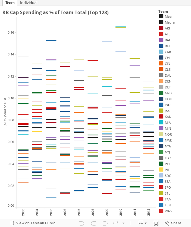
NFL Spending on RBs
For those of you who really wanted to read through the whole post I did on the value of running backs but just didn't make it, here's the Tableau visualization from the end. Check both tabs to see the percent of team cap spend on running backs and then all players with running backs highlighted.
Thursday, October 3, 2013
Nobody spends money on running backs, right?
In the wake of the Trent Richardson trade from Cleveland to Indianapolis, it seems like a lot of conventional wisdom holds that running backs are overpaid and teams are stupid to pay them a lot of money. Please enjoy some out of context tweets that support my assertion:
This Browns regime didn't draft Richardson, it's an era where fewer RBs going 1st round and if they don't value him that highly, makes sense
— Jason La Canfora (@JasonLaCanfora) September 18, 2013
also, on this Richardson deal, this had nothing to do with "scheme" or "fit." it was about value and upside evaluation on the Browns part
— Jason La Canfora (@JasonLaCanfora) September 19, 2013
Browns source says Richardson just wasn't a great fit, so getting a 1 was great value. Cleveland now has 2 1's, a 2, 2 3's and 2 4's in '14.
— Albert Breer (@AlbertBreer) September 18, 2013
Good move by Browns to get what they could for a player drafted too high.
— Steve Drake (@SteveDrake_) September 18, 2013
Ask yourself: if Trent Richardson were a 4th round pick, what would Indy have traded for him?
— Steve Drake (@SteveDrake_) September 18, 2013
Nervous that Cleveland, the team I grew up with except for those three years when they were gone and the subsequent years when they’ve been terrible, had made a mistake, I wanted to dig into the data and see about the “devaluation” of running backs in practice. Unfortunately for the timeliness of this post I did not have the data handy and had to construct the data set.
Working from a number of sources I duct taped together a data set that could serve my needs, tied name/team/year combinations to positions and stepped back to look at the result.


This does not fit my narrative. Fear not, though, because we haven’t yet taken into account the contemporary increase in the salary cap – so substantial in the 2003 to 2009 period.
Monday, September 9, 2013
Fun with Tableau - How well do NFL teams know their own players?
I am working on a post examining how well teams know their own assets by looking at the difference in performance of players who stay with the same team and those who go to a different team. This post is still a ways from being ready.
In the meantime, however, I decided to play around with Tableau and put together a visualization of the raw data. Play around with it to draw your own conclusions:
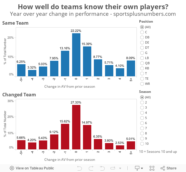 For those of you not familiar with Approximate Value, see the background here.
Average performance (denominated in AV) of different levels since 1994:
Non-Starter: 1.2
Starter: 6.6
Pro Bowler: 11.6
All Pro: 14.4
In the meantime, however, I decided to play around with Tableau and put together a visualization of the raw data. Play around with it to draw your own conclusions:
Average performance (denominated in AV) of different levels since 1994:
Non-Starter: 1.2
Starter: 6.6
Pro Bowler: 11.6
All Pro: 14.4
Third-year NFL players and the new rookie contract system
One of the biggest changes of the 2011 NFL lockout and
subsequent collective bargaining agreement was the introduction of mandatory
slotting for rookie contracts. In addition to slotting, the players association
consented to mandatory four year contracts for all draft picks with a mandatory
team option for first rounders. The league certainly gave up some things in
exchange – minimum cash spending to all players and stronger guarantees for top
rookie contracts – but the net effect was a severe restriction in the cash
available to rookies.
A lot of analysis has been written about the value of
draft picks in this new era. I am guilty of printing a few words on the topic
myself. Bill Barnwell’s recent NFL trade value column highlighted the
incredible value of a rookie contract by placing Cam Newton, Colin Kaepernick,
Russell Wilson, Andrew Luck and Robert Griffin III among the most valuable
assets in the league.
One attribute of the new system, however, is being downplayed
in most of the analysis out there: the restriction on renegotiation ends with
the final game of a player’s third season. I expect the agents for Newton, Kaepernick,
Wilson, Luck and Griffin have the Monday following week 17 this year (Newton
and Kaepernick) and next year (Wilson, Luck and Griffin - and Brandon Weeden) circled on their
respective calendars.
The calm descended over younger players’ contracts is a
lull before the first wave of elite players hits the end of their third season.
At that point expect lots of contract extensions with big guaranteed money.
Colin Kaepernick is probably aware that Joe Flacco signed an extension with $60
million coming in the first three years while Kaepernick himself is scheduled
to earn $740,844 in salary this year (the remainder of his cap hit comes from amortized
bonus).
Teams certainly have leverage in the extension
negotiations given the additional year plus a fifth year option for first
rounders, but NFL teams always have leverage with the franchise tag lurking. Look
for bargaining to split between those who take care of their young players
quickly – buying off the immediate pain with higher cap hits down the road –
and those who drag it out, risking a holdout or very unhappy player to control
costs. The scope will be relatively limited as fewer players have leverage the
way that draft picks do (what draft pick has ever underperformed before suiting
up?). Those who have do have leverage based on their on-field performance will
have it on par with the top picks of the old system.
The pending big extensions for Newton and Kaepernick
won’t diminish the value they have provided in their first three seasons, and structural features such as the franchise tag will help maintain some surplus value for teams in new deals. These
extensions should, however, make it clear that teams that hit the jackpot on
their picks got a three year bargain contract rather than five.
Thursday, August 29, 2013
Returns to inequality in sports
Now that the last of my posts on returns to income inequality is up seems like the time for a quick reflection on the concept overall and how well it explained the success of teams.
The returns to inequality
The NBA is where the inequality of a team appears to make a difference in the expected success. This fits with the narrative that teams need to have a star (or several) rather than a surplus of role players. In all of the other leagues analyzed it does not make a significant difference. The NFL and MLB show a negative coefficient. Inequality harms a team in those two leagues. The NHL – most similar to the NBA in salary structure and individual player leverage – is the only other league to show a positive correlation between inequality and team performance.

This whole analysis is necessarily limited. The cumulative build-up of a team’s salaries can only tell us so much (R-squared values MLB=0.13, NBA=0.32, NFL=0.07, NHL=0.13) about the way they perform on the field/ice/court. It is a prediction, sometimes made years before, and made either under duress as part of a bidding process for a free agent or dictated by the terms of the collective bargaining agreement to a draft pick.
Still, it is interesting that one of the coefficients was significant while two others were close (p-value 0.2) after controlling for overall team spending. Even if it just confirmed what people already “knew” it was interesting enough for me.
Looking at a metric more-strictly focused on performance like WAR for baseball or Win Shares for basketball is problematic because end-of-season numbers incorporate the ups and downs of actual performance, so the team’s sum total matches to the performance. For 2012 (or 2012-13 for basketball) the WAR correlation with run differential is 0.89 while the Win Shares correlation with point differential is 0.997. These metrics are very good at allocating out the runs (points) to match their actual totals after the fact.
Unfortunately for us, the effects of a transcendent star making others better – or of a well-balanced team attacking weak links in opposing defenses – are already baked into these backward-looking metrics. To be useful we would need to look at the pre-season expected totals. Perhaps in a future post.
Monday, August 26, 2013
Returns to inequality in the NHL
Take a look over here if you want to get the background for this series, otherwise read on.
Sports + Numbers Prediction: "I am guessing that returns to inequality are strong here too, with relatively high leverage of the individual players resembling the NBA more than the NFL or MLB."
The data
To see the impact of inequality we will look at each team’s Gini coefficient against their winning percentage, controlling for team spending. The resulting equation gives us an r-squared value of 0.13 with only salary spending being significant (P-value of 0.00008) while the Gini coefficient comes in at a P-value of 0.21.
 |
| Payroll vs Points % (total points / potential points) - NHL 2009-10 to 2012-13 |
For every million dollars in team spending the expected increase in winning percentage is 0.00397. For a team that spends $10 million more than a comparable team – all else equal – we would expect them to win 3 additional games (or win 2 more with two additional overtime losses (or win 1 more with four additional overtime losses (or win the same number but have six additional overtime losses))).
 | ||
|
On inequality the - insignificant - coefficient is 0.19. Within the range of Gini coefficients in baseball (0.22 to 0.47) this would mean a difference of 8 points (4 wins but I’ll spare the rest) from the most equal to the least equal (more wins to the least equal). Not nothing but not exactly a huge impact. The gap in payroll ($30 million to $71 million) projects to a gap of nearly 27 points.
 | ||
|
Subscribe to:
Posts (Atom)